
Creative Design
Visual Hierarchy in Design: Guide the Eye to What Matters
By Kavin P · · 7 min read
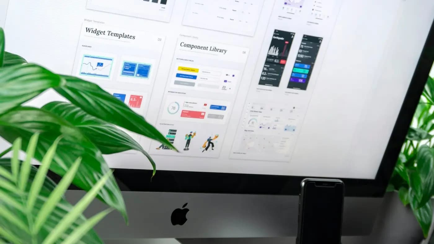
Open any well-designed poster, web page or slide and your eye knows where to start. It lands on the headline, moves to the image, picks up a supporting line and finishes at the call to action. That sequence is not an accident. It is visual hierarchy: the arrangement of elements so that the most important ones are seen first and the rest follow in a sensible order. Understanding visual hierarchy in design is one of the fastest ways to improve everything you create.
What visual hierarchy is
Hierarchy organises information by importance. A design with no hierarchy makes every element compete for attention, so the viewer does not know where to look and may leave. A design with a clear hierarchy lets people grasp the message in seconds and then explore details if they want to.
Hierarchy works in every medium: social posts, presentations, packaging, brochures, apps and websites. The principles are the same.
The main tools of hierarchy
Size
Larger elements draw attention first. Make the primary headline or image the biggest item, and reduce the size of secondary content. Avoid making too many elements the same size, which flattens the hierarchy.
Contrast
Differences in light and dark, thickness or colour make elements stand out. A bold headline on a plain background commands attention. High contrast for important elements and lower contrast for less important ones directs the eye. Always check that text remains readable and accessible.
Colour
A bright or saturated colour among neutral shades attracts the eye. Use an accent colour sparingly for key actions, such as a button, so it keeps its power. If everything is bright, nothing stands out. See brand colour palette guide and color psychology in marketing.
Typography
Font size, weight, case and style create levels: headline, subheading, body, caption. Use a consistent scale and limit the number of fonts. Bold or heavier weights draw attention; light weights recede. The typography for brands article gives more detail.
Spacing and proximity
White space around an element isolates it and signals importance. Related items placed close together look like a group. Larger gaps separate different groups. Spacing is often more effective than lines or boxes.
Position and alignment
People usually begin at the top left in left-to-right languages and scan down. Placing key elements in prime positions, such as the top or the centre, helps. Alignment creates order and shows relationships. A strong left edge, for example, helps the eye scroll down a column. See layout and grid design basics.
Imagery
Photographs, faces and illustrations attract attention. An image that points or looks toward text can guide the eye. A bold image can be the primary focal point, supported by a smaller headline.
Shape and framing
Boxes, outlines and shapes can group content or highlight elements. Use them sparingly, as too many boxes cause clutter.
Common reading patterns
Understanding how people scan helps you place content.
- F-pattern: on text-heavy pages, people often read the top line, then scan down the left side, reading a shorter line partway. Put key information at the start of lines and paragraphs.
- Z-pattern: on simpler layouts, the eye travels from top left to top right, diagonally to bottom left and across to bottom right. Place the logo, headline and call to action along this path.
- Centre-focused: posters and ads with a strong central focal point.
Reading patterns vary by culture, language and device. Test with real viewers.
Apply hierarchy to common formats
Social media posts
Decide on a single main message. Make it large and clear, with a simple background. Add a supporting line in smaller text and a small logo. Leave margins and avoid clutter. See social media post design tips.
Presentation slides
One main idea per slide: a clear title, a single key visual and limited text. Use size and colour to highlight the key number or phrase. See presentation design tips and pitch deck design guide.
Landing pages and websites
The top of the page should communicate what you offer and what to do next. Use a clear headline, a supporting sentence, an image and a prominent button. Below, use sections with headings and consistent styles. The landing page design principles and ui design basics for non-designers cover this in depth.
Flyers and posters
A strong focal point, a headline readable from a distance, and essential details such as date, place and contact. See poster design tips.
Email and ads
A clear subject or headline, a single call to action and minimal distractions. See banner ad design tips.
A step-by-step method
- List your content and rank it: what must the viewer see first, second and third?
- Assign visual weights. Make the first item the most prominent, the second less so and so on.
- Group related items using proximity.
- Choose one focal point. If there are two equally strong elements, one should yield.
- Check the flow. Trace the path your eye takes. Does it follow the intended order?
- Remove or reduce anything that competes.
- Test it: squint at the design or blur it slightly. The most important elements should still stand out. Alternatively, ask someone to look at it for five seconds and describe what they remember.
Mistakes to avoid
- Everything bold and big.
- Too many colours or fonts.
- Low contrast for key elements.
- Crowded layouts with no breathing room.
- Competing focal points.
- Hiding the call to action.
- Ignoring mobile layouts, where hierarchy may change.
Accessibility and hierarchy
Hierarchy should work for everyone. Use real heading structures on web pages so screen readers can navigate. Do not rely on colour alone to show importance. Ensure text contrast meets accessibility guidelines. The accessible web design basics article provides simple checks.
Before and after: a simple flyer
Imagine a workshop flyer where the title, date, price, speaker name, location, three benefits and a long paragraph are all in the same font size and weight. Nothing stands out, and the reader cannot tell what to do.
To fix it:
- Make the workshop title the largest element, in bold.
- Put the date and time directly beneath it in a medium size, since attendance depends on them.
- Show the three benefits as short bullets in regular weight.
- Reduce the long paragraph to two lines, or move it to a web page.
- Make the call to action ("Reserve your seat") a button-style block in your accent colour.
- Place the speaker name and location in small but legible text near the bottom.
- Add generous white space around the title and the button.
The flyer now has a clear order: what, when, why and how to book. The information has not changed, but the viewer can finally read it.
Hierarchy in data and dashboards
Charts and reports need hierarchy too. Put the key metric in large type, with supporting numbers smaller. Use colour to highlight changes that need attention, and neutral tones for context. Group related metrics together and give each group a clear heading. Avoid decorative effects that distract from the data. A well-structured report helps decision makers see what matters in seconds. The tips in data visualization for reports show how to apply these ideas.
Cultural and language considerations
Reading direction affects layout. Right-to-left languages such as Arabic and Hebrew mirror the typical scanning pattern, and some scripts need more line spacing or larger sizes to be legible. If you design for multiple languages, test the hierarchy in each, since text length and style vary. Be aware of colour meanings and imagery conventions in different cultures. Involve native speakers in review. Good hierarchy should feel natural to the audience it serves.
Practice
Take a design you made recently and write down the three most important things a viewer should notice. Then look at the design and see whether those three things stand out in that order. Adjust size, colour and spacing until they do. Repeat on other designs, and the process will soon become instinctive.
If you would like help improving your brand's design materials, contact me.
Frequently asked questions
What is the simplest way to create hierarchy?
Make the most important element the largest or most contrasting, group related items together and use plenty of white space.
How many levels of hierarchy should a design have?
Typically three: primary, secondary and tertiary. More levels can confuse the viewer.
Does visual hierarchy apply to websites?
Yes. Headings, spacing, colour and layout all create hierarchy that guides visitors to read and take action.
How can I test whether my hierarchy works?
Squint or blur the design, or show it to someone for five seconds and ask what they noticed first.
Related articles
Creative Design7 min read
Brand Photography Guide: Plan Shoots That Build Trust
A brand photography guide for small businesses: define your style, plan a shot list, work with a photographer, use light well and manage rights and files.

Creative Design7 min read
Brochure Design Tips: Layout, Copy and Print Choices
Brochure design tips for small businesses: choose a fold, structure content, write clear copy, use images and branding well, prepare for print and track results.

Creative Design7 min read
Canva Brand Kit Setup: Keep Every Design On Brand
A step-by-step Canva brand kit setup: add logos, colours and fonts, build templates, organise folders, set team permissions and keep designs consistent.