
Website Design
Landing Page Design Principles for Clearer, Calmer Pages
By Kavin P · · 8 min read
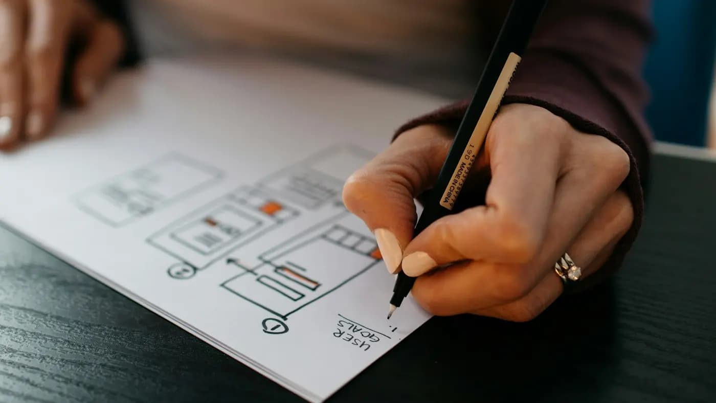
A landing page has one job: to help a visitor take a single action. Unlike a homepage, it does not need to explain your whole business or offer ten different paths. It needs to make one next step feel obvious and easy.
The principles below are about design, the arrangement of space, type, colour and elements that guides attention. For wording and offers, see the companion landing page conversion tips, and for testing, the landing page A/B testing guide.
Principle 1: One page, one goal
Everything on the page should serve a single conversion, whether that is a form submission, a phone call, a purchase or a download. Name the goal before designing.
A useful test: write the goal in a sentence, then look at each element and ask, "Does this help someone reach it?" If not, remove it or move it lower.
This is why navigation menus are often reduced or removed on dedicated landing pages. Extra links invite visitors to wander off. If you keep a menu, keep it minimal and make the main action more prominent than any link.
Principle 2: Match the visitor's expectation
People arrive from an ad, an email or a search result with an expectation. The first screen should confirm they are in the right place.
- Echo the headline or offer that brought them there.
- Reuse the same imagery or colours as the ad where possible.
- Keep the promise consistent from click to page.
This is called message match. If the ad says "Free website audit checklist" and the page says "Welcome to our digital agency", the visitor feels uncertain and leaves. The ad copywriting tips post covers the other half of this match.
Principle 3: Design the first screen deliberately
The top of the page, before any scrolling, does most of the work. It should include:
- A headline that states the benefit.
- A short supporting line that adds clarity.
- A primary action, usually a button or short form.
- One supporting visual that reinforces the offer.
Keep this area uncluttered. Many pages fail by squeezing a logo, a menu, a slider, three badges and a block of text into the same space. Choose what matters, and give it room.
Do not assume visitors will scroll to find the button. Place the main action in the first screen, then repeat it lower down for people who need more convincing.
Principle 4: Build a visual hierarchy
Hierarchy tells the eye where to look first, second and third. You create it through size, weight, colour, contrast and spacing.
- Make the headline the largest text.
- Use a clear step down for subheadings and body text.
- Give the main button the strongest colour contrast on the page.
- Use white space to separate groups of content.
Squint test: blur your eyes at the page. The elements that remain visible should be the headline and the button. If something decorative stands out instead, adjust. The graphic design principles for marketers guide explains these tools in more depth.
Principle 5: Use whitespace as a feature
Whitespace, the empty space around elements, is not wasted. It lets content breathe, improves reading and makes the action stand out.
Give sections generous top and bottom padding. Keep lines of text a comfortable length. Resist filling every gap because you feel the page looks empty. Crowded pages feel stressful; spacious pages feel confident.
Principle 6: Keep the layout simple and scannable
Most visitors scan before they read. Design for scanning.
- Use short sections with clear subheadings.
- Break content into bullets when you list benefits.
- Keep paragraphs to two or three lines.
- Use icons or small images to separate ideas, but only if they add meaning.
A single column layout is often the most reliable, particularly on phones, since it presents one thing at a time. A two-column layout can work for a hero section with text on one side and an image or form on the other, as long as it stacks neatly on small screens.
Principle 7: Make the call to action unmistakable
Your button is the point of the page. Design it to be seen and understood.
Visual design
- Use a colour that contrasts strongly with the surroundings.
- Make it large enough to tap comfortably with a thumb.
- Add padding inside the button so the label has room.
- Keep the same style for all buttons with the same action.
Wording
- Start with a verb that describes what happens next, such as "Get my free checklist" or "Book a call".
- Avoid vague labels like "Submit".
Repeat the same action in two or three places, not three different actions. Consistent repetition helps decisive visitors act early and gives hesitant visitors a second chance later.
Principle 8: Keep forms short and kind
If your page has a form, the design of that form affects completion more than most other details.
- Ask only for what you truly need now.
- Use clear labels above each field, not just placeholder text that disappears.
- Make fields wide enough and easy to tap on mobile.
- Show error messages next to the problem, in plain language.
- Explain what happens after submission.
Every extra field is a reason to quit. If you need more information, collect it later in a follow-up step. For tone in labels and messages, see UX writing and microcopy.
Principle 9: Build trust through design
Visitors judge credibility in seconds. A page that looks careless feels risky, especially if you ask for personal details or payment.
- Use real, consistent branding and clean alignment.
- Show genuine testimonials, logos or examples of work, but only ones you are allowed to use and that are true.
- Display contact details and privacy information.
- Avoid pop-ups that block the page immediately.
The social proof in marketing guide explains how to present proof without exaggeration.
Principle 10: Design mobile first
Many visitors will arrive on a phone, so design that version first, then expand for larger screens.
- Put the headline and button high on the page.
- Use text large enough to read without zooming.
- Leave enough space between tappable elements.
- Keep images light so the page loads fast.
Slow pages lose visitors before the design is even seen. Review mobile-friendly website design tips and website speed optimization tips as part of your checklist.
A hypothetical example
Imagine a small dental clinic running an ad for a free first consultation. Its old page was the full homepage, with a menu, eight services and three buttons. The redesigned page keeps a short headline matching the ad, a photo of the clinic reception, three benefit bullets, a short booking form and a phone number. The clinic removes the menu and repeats the booking button once further down. Visitors now have one obvious path.
Principle 11: Review before you publish
Before launch, walk through the page like a stranger.
- Does the first screen state the offer?
- Is the main action clear without scrolling?
- Are there any elements that distract from the goal?
- Does the page work on a small phone screen?
- Do the form and thank-you message work properly?
- Is every claim honest and supportable?
Then watch a real person use it and note where they hesitate.
Common design mistakes to avoid
Even pages that follow the principles can slip. Watch for these problems in review.
- Competing buttons. Two equally strong calls to action split attention. Make one primary and the other quiet.
- Autoplay media. Sound or moving video that starts without warning irritates visitors and slows the page.
- Decorative sliders. Rotating banners hide your message. Pick the strongest one and show it.
- Stock-photo overload. Generic images add weight without adding meaning. Use pictures that show the product, the place or the people.
- Walls of text. Break long explanations into short blocks with headings and bullets.
- Hidden costs or terms. Surprising visitors after they click destroys trust. State key conditions near the button.
Check the thank-you step
The page does not end at the click. Design the confirmation message or thank-you page so it says what happens next, how long it will take and where to go from here. A blank screen after a form leaves people wondering whether anything happened, and may lead them to submit twice.
Takeaway
The best landing page design principles are about focus: one goal, message match, a clear first screen, strong hierarchy, generous whitespace, an unmistakable button, a short form and visible trust. Build mobile first, test with real users and keep simplifying.
If you want a landing page that is clear and well-designed, see the website portfolio or get in touch to discuss your campaign.
Frequently asked questions
What is the difference between a landing page and a homepage?
A landing page serves one goal for one audience, usually after an ad or email click. A homepage introduces the whole business and offers many paths. Landing pages remove distractions to focus on a single action.
Should a landing page have a navigation menu?
Often it is better to remove or reduce it so visitors stay focused on the single action. If you keep a menu, make it minimal and ensure the main button is clearly more prominent.
How long should a landing page be?
It should be as long as needed to answer the visitor's questions about the offer. Simple, low-commitment offers can use a short page, while higher-commitment offers usually need more explanation and proof.
How many fields should a landing page form have?
Ask only for what you truly need to deliver the offer. Fewer fields reduce friction. Name and email are often enough for a download, and extra details can be collected later in a follow-up.
Related articles
Website Design7 min read
404 Page Design: Turn Dead Ends Into Helpful Detours
Good 404 page design keeps lost visitors on your site. Learn what to write, what to include and how to find and fix the broken links that cause the problem.

Website Design7 min read
Cookie Consent Banner Guide: Clear, Fair and Easy to Use
A practical cookie consent banner guide: what to audit, how to word choices, where to place it and how to keep it fair, with a reminder to check local rules.

Website Design8 min read
Core Web Vitals Explained in Plain English for Site Owners
Core Web Vitals explained without jargon: what the three measures mean, how to check them for free, and the simple fixes that make your pages feel faster.