
Creative Design
Graphic Design Principles for Marketers: A Practical Guide
By Kavin P · · 8 min read

Good design is not decoration. For a marketer, it is the way a message gets noticed, understood and remembered in a few seconds. You do not need a design degree to apply a handful of reliable principles, and this guide walks through them in plain language.
Why design principles matter for marketing work
Every piece of marketing competes with a feed, an inbox or a crowded shelf. People scan before they read, and they decide in a moment whether something deserves their attention. Design principles are simply the habits that make scanning easy.
When you understand them, you stop guessing. You can look at a flyer or a banner and say exactly why it feels cluttered, or why the offer is easy to miss. That makes feedback faster and revisions fewer.
It also helps you brief designers better. Instead of saying "make it pop", you can ask for stronger contrast on the headline or more space around the button.
Start with one clear goal
Before opening any design tool, write one sentence: what should the viewer do or understand after looking at this? A webinar poster might aim to get a registration. A social post might aim to make someone stop scrolling and read a tip.
That single goal decides what gets the most visual weight. Everything else is supporting detail. If you cannot name the goal, the design will try to say five things at once and say none of them well.
A useful test is to show the draft to someone for three seconds and ask what they remember. If the answer is not your goal, the layout needs work.
Visual hierarchy: tell the eye where to go
Hierarchy is the order in which people notice things. You control it with size, weight, colour and position. The biggest, boldest, highest-contrast element is read first.
A reliable structure has three levels:
- Primary: the headline or main image, which carries the core message.
- Secondary: a supporting line, key details or a short benefit list.
- Tertiary: fine print, logos, dates or contact information.
If everything is bold, nothing is. Pick one hero element per design and let the rest step back. When two elements fight for attention, shrink or soften one of them.
Contrast and colour
Contrast is the difference between elements, and it is what makes text readable and buttons clickable. Dark text on a light background, or the reverse, is the safest choice for anything people must read.
Use colour with intention:
- Choose a small palette, usually one main colour, one accent and neutrals.
- Reserve the accent colour for the action you want, such as a button or a key number.
- Avoid placing coloured text on a similarly bright background, even if it looks fine on your screen.
If you are still building a palette, the brand colour palette guide explains how to choose and organise colours so they stay consistent across channels.
Check readability on a real device
Colours shift between monitors and phones. Before sending a design out, view it on a phone at arm's length and in bright light. If the text strains your eyes, adjust the contrast.
Alignment, proximity and white space
Alignment means lining elements up along shared edges. It quietly signals order and professionalism. Pick a left edge, or a centre line, and keep to it rather than nudging items to arbitrary positions.
Proximity means grouping related items close together and separating unrelated ones. A heading should sit nearer to its paragraph than to the element above it. This tells the viewer what belongs together without any extra lines or boxes.
White space, sometimes called negative space, is the empty area around elements. Beginners often fill every gap because it feels wasteful to leave it blank. In practice, space is what gives your message room to breathe and makes the important parts stand out.
A quick fix for a crowded layout is to remove one element and increase the margins. Often the design improves immediately.
Typography basics for non-designers
Type does much of the work in marketing design. A few rules cover most situations:
- Use no more than two typefaces, one for headings and one for body text.
- Keep line lengths comfortable, and avoid very long lines of small text.
- Make the size difference between headings and body obvious.
- Avoid setting long passages in capitals or in thin, decorative styles.
For a deeper look at choosing and pairing fonts, see typography for brands. Consistent type choices are one of the fastest ways to make scattered materials look like they come from one business.
Consistency, repetition and a simple system
Repetition builds recognition. When your posts, ads and documents share colours, fonts, spacing and a logo position, people begin to recognise you before reading a single word.
You can create a lightweight system without a large brand manual:
- Save your colours and fonts in a one-page reference.
- Build two or three reusable templates for the formats you use most.
- Decide a standard margin and logo placement.
- Keep a folder of approved images and icons.
If you are starting a business from scratch, brand identity basics for startups shows how these pieces fit into a broader identity. For social formats specifically, social media post design tips covers sizing and layout in more detail.
Imagery, icons and a short review routine
Choose images that support the message rather than fill space. Generic, obviously staged photos tend to be ignored. Real product shots, simple illustrations or clean icons usually communicate better. Keep the style consistent, so you are not mixing flat icons with glossy photographs in one layout.
Before you publish, run a short review:
- Can the main message be understood in three seconds?
- Is there one clear action?
- Is the text readable on a phone?
- Is anything on the page there only because it was available?
- Do colours, fonts and logo match your usual materials?
Imagine a small bakery preparing a poster for a weekend offer. The first draft shows six cakes, three fonts and the address in the same size as the headline. After applying these principles, the poster keeps one cake photo, one bold offer line, a smaller date and the address at the bottom. The message is the same, but it is now readable from across a room.
Common mistakes to avoid
Even with the principles in mind, a few habits regularly undermine marketing designs. Watching for them saves a lot of rework.
- Too many fonts and effects. Drop shadows, outlines, gradients and several typefaces on one layout make the message hard to read. Use effects only when they serve a clear purpose.
- Stretching or squashing images. Distorted logos and photos look careless. Always scale proportionally and crop instead of stretching.
- Low-resolution files. An image that looks fine on a small preview can look blurry in print or on a large screen. Start with the highest quality version you have.
- Text too close to the edge. Leave a safe margin so nothing is cut off when a design is cropped by a platform or a printer.
- Ignoring the format. A square post, a vertical story and a wide banner need different layouts. Resize thoughtfully rather than shrinking the same design into every shape.
- Designing for yourself. You know the product, so everything seems obvious. Your audience does not, so keep the message simple and explicit.
A simple workflow you can reuse
A repeatable process makes good design less dependent on inspiration. Try this sequence for each new piece.
- Define the goal and audience in one or two sentences.
- Write the words first. A headline, a supporting line and an action are usually enough. Design around real copy rather than placeholder text.
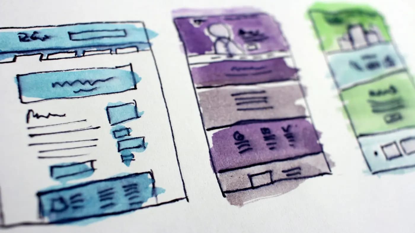
- Sketch a rough layout on paper or in a simple tool, placing the main element first.
- Build the first version using your brand colours and fonts.
- Review against the checklist above, then remove anything unnecessary.
- Test on the real channel. Preview it as a phone screen, a printout or an email, depending on where it will appear.
- Save it as a template if you will make something similar again.
Working in this order prevents the common trap of choosing pretty visuals and then forcing the message to fit around them.
Key takeaways
Strong marketing design comes from a few repeatable habits: define one goal, build a clear hierarchy, use contrast and colour deliberately, respect alignment and white space, and stay consistent. None of these require advanced software, only attention and practice.
Pick one upcoming piece of content and apply just two principles to it, perhaps hierarchy and white space. Then compare it with your previous version. If you would like help building templates or a visual system for your business, you can get in touch or browse the free resources.
Frequently asked questions
What is the most important design principle for marketers?
Visual hierarchy is usually the most useful starting point. It decides what people notice first, so it ensures your headline, offer or call to action is seen before supporting details. Get that right and other choices become easier.
Do I need expensive software to apply design principles?
No. The principles work in any tool, including free ones. Hierarchy, contrast, spacing and consistency are about decisions, not features. A simple tool and a clear goal will usually beat advanced software used without a plan.
How many fonts and colours should a marketing design use?
A good rule is two typefaces at most and a small palette of one main colour, one accent and neutrals. Limiting choices keeps designs cohesive and makes your materials easier to recognise across channels.
How can I tell if my design is too cluttered?
Show it to someone for three seconds and ask what they remember. If they cannot name the main message, there are too many competing elements. Remove one item, add margin and test again.
Related articles
Creative Design8 min read
Banner Ad Design Tips That Earn Attention and Clicks
Practical banner ad design tips for small businesses: structure, copy, imagery, sizes and testing, so your display ads get noticed without looking cluttered.

Creative Design8 min read
Business Card Design Tips for a Card People Actually Keep
Business card design tips for small business owners: what to include, how to lay it out, paper and finish choices, and how to prepare files for print.

Creative Design7 min read
Giving Design Feedback That Designers Can Act On
Giving design feedback is a skill. Learn how to describe problems, tie comments to goals, avoid vague notes and run a review round that ends with a better result.