
Creative Design
Banner Ad Design Tips That Earn Attention and Clicks
By Kavin P · · 8 min read
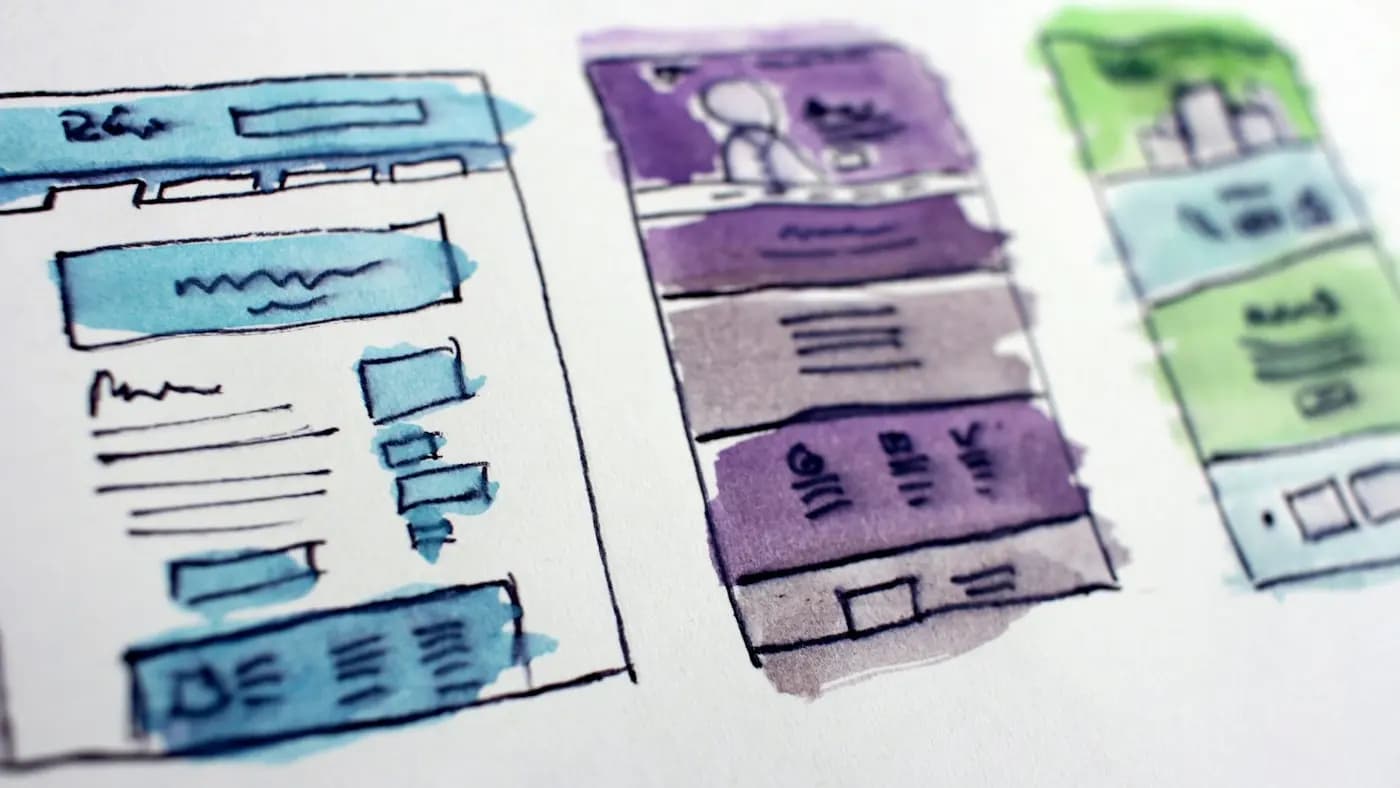
A banner ad has about as much time as a glance. It sits beside content people actually came to read, so it has to earn attention in a fraction of a second and then deliver one clear idea. Cramming in everything you sell is the fastest way to be ignored.
These banner ad design tips focus on decisions you can make with simple tools: what to say, how to arrange it, which sizes to prepare and how to improve over time.
Start with one goal and one message
Every banner should push one action. Decide it before opening a design tool.
Ask:
- What single thing should the viewer do? Visit, sign up, call, or buy?
- What single benefit makes that action attractive?
- Who exactly is the banner for?
Write the message as one short sentence. If you need the word "and" to describe the banner, you probably have two banners. A bakery promoting a weekend cake sale and its new catering menu should create two separate ads rather than blending them.
This discipline also helps your ad targeting. If you are building the surrounding campaign, the Google Ads for beginners guide covers where display ads fit.
Build a clear visual hierarchy
Hierarchy is the order in which the eye moves through the ad. In a small space, aim for three levels only:
- Level one: the hook. A short headline or striking image that stops the scroll.
- Level two: the support. A line that explains the offer or benefit.
- Level three: the action. A button or clear call to action, plus the logo.
Make level one dominant by size and contrast, level two smaller, and level three distinct through colour. If everything is the same size, nothing leads. The graphic design principles for marketers article explains contrast, alignment and spacing in more depth.
Write copy that fits in one glance
Banner copy is closer to a street sign than a paragraph. Keep it tight.
Headline
- Aim for roughly three to seven words.
- Lead with the benefit or the offer, not the company name.
- Use plain language and active verbs.
Supporting line
- One short phrase at most.
- Add a reason to act, such as a deadline or a condition, only if it is true.
Button text
- Use a specific verb: "Get the guide", "Book a visit", "See the menu".
- Avoid vague words like "Click here" or "Submit".
For more help shaping the words, ad copywriting tips goes deeper into headlines and offers, and copywriting formulas for marketers gives structures you can borrow.
Choose imagery with a clear focal point
An image should support the message in an instant. The best banner visuals have one obvious subject.
- Use a single product, face or object rather than a collage.
- Crop in tight so the subject is readable at small sizes.
- Pick images with a calm area where text can sit.
- Avoid generic stock photos that look like every other ad.
If a person appears, choose someone looking toward the text or the button, since viewers tend to follow where others look. If you plan to edit your own photos, the photo editing basics for marketers post covers cropping, brightness and clean backgrounds.
Use colour and contrast on purpose
Contrast is what makes a banner stand out from a busy page.
- Pick a background that contrasts with typical web pages. A plain white banner can vanish into a white page, so consider a coloured background or a thin border.
- Keep to two or three colours from your brand palette.
- Make the button the highest-contrast element.
- Ensure the text is easy to read on whatever sits behind it.
Using your brand palette consistently means a viewer who sees your ad on several sites starts to recognise it. If colour choices confuse you, color psychology in marketing offers a sensible way to think about them.
Pick readable type
Small ads magnify typography problems. Follow these basics:
- Use one font family, with at most two weights.
- Choose clean, sturdy letterforms; avoid thin, decorative scripts.
- Keep text large enough to read on a phone.
- Avoid putting long text in capitals.
- Leave generous line spacing and margins.
If the text starts to look cramped, remove words instead of shrinking type. Cutting is almost always the right fix.
Prepare the right sizes
Ad platforms accept several standard shapes, and each placement favours a different layout. Rather than memorising dimensions, think in categories:
- Wide horizontal banners suit headers and the top of articles.
- Square and medium rectangles sit inside content and tend to be flexible.
- Tall vertical formats suit sidebars.
- Mobile banners are short and wide, so the message must be even shorter.
Check the current size list on the platform you are using, since formats are updated from time to time. Design the most flexible size first, then adapt rather than starting from scratch. Keep the logo, headline and button in consistent relative positions so the family of ads feels connected.
Design for mobile first
Many people will see your ad on a small screen. Zoom out your design to the size of your thumb and check that you can still read the headline and spot the button. If you cannot, simplify.
Keep file weight and quality in check
Heavy files load slowly and some platforms reject them. Export images in efficient formats, compress without making them blurry, and avoid unnecessary effects. If you use animation, keep it short, with a clear still frame that tells the whole story, because some placements show only the first or last frame.
Consider these animation habits:
- Limit movement to two or three simple steps.
- Make sure the key message is visible before the animation ends.
- Avoid flashing or fast motion that is distracting or uncomfortable.
Match the banner to the landing page
A common reason banners disappoint is a mismatch after the click. If the ad promises a discount and the page opens on a generic homepage, people leave.
Make sure the landing page:
- Repeats the headline or offer from the banner.
- Uses the same visuals and colours.
- Puts the next step above the fold.
See landing page design principles for how to build a page that carries the promise through.
Test one change at a time
You rarely get a banner right first time, and that is normal. Plan to test deliberately.
- Create a baseline ad.
- Change one element, such as the headline, the image or the button text.
- Run both versions long enough to compare fairly.
- Keep the stronger version and test the next element.
Resist changing five things together, since you will not know what made the difference. The ad creative testing guide lays out a repeatable process.
A hypothetical example
Imagine a small yoga studio promoting a beginner course. The first banner shows a group photo, a long headline and three bullet points. The revised version shows one person in a calm pose, the headline "Start yoga this month", and a button reading "See the class times". The second layout gives the eye one place to go, and the studio can now test headlines against each other.
Quick pre-launch checklist
- One goal and one message.
- Headline readable at thumb size.
- Button clear and high contrast.
- Logo present but not dominant.
- Borders or backgrounds that separate the ad from the page.
- Correct sizes exported and compressed.
- Landing page matches the promise.
Common banner mistakes and how to fix them
Knowing the usual traps makes your own review faster.
- Too many messages. If a banner promotes three offers, viewers remember none. Split it into separate ads.
- Tiny logo or no logo. The viewer should know who is speaking, even if they never click. Keep the logo visible but secondary.
- Weak button. A pale button on a pale background disappears. Raise contrast or add a border.
- Cluttered corners. Stray badges, stickers and starbursts compete with the headline. Keep only the element that earns its place.
- Stock image mismatch. A glossy office photo for a neighbourhood repair shop feels false. Use real photos of your work when you can.
- Ignoring the page it sits on. Look at a few typical sites where your ad might appear, and check that yours still stands out among their colours.
When you review a draft, view it next to a screenshot of a real web page. If your ad would not catch your own eye there, revise before spending any budget.
Takeaway
Strong banner design is about restraint. One message, a clear hierarchy, readable type, a focused image and a visible button will beat a busy layout every time. Then test and refine, one change at a time.
If you would like a set of consistent, well-structured ad creatives for your campaign, see the design portfolio or get in touch.
Frequently asked questions
What makes a banner ad effective?
An effective banner has one clear goal, a short benefit-led headline, a single focal image and a high-contrast button. It reads in a glance, matches the landing page and is tested against alternatives over time.
How much text should a banner ad have?
As little as possible. A headline of a few words, one short supporting phrase and a specific button label is usually enough. If the text feels cramped, remove words rather than shrinking the type.
Should I use animation in banner ads?
Animation can help if it is short, simple and ends on a clear message. Make sure the still frame also tells the full story, and avoid flashing or rapid motion that distracts or irritates viewers.
Which banner sizes should a small business prepare?
Prepare a few flexible categories: wide horizontal, square or medium rectangle, tall vertical and a mobile banner. Check the platform's current size list, then design one main version and adapt it.
Related articles

Creative Design8 min read
Business Card Design Tips for a Card People Actually Keep
Business card design tips for small business owners: what to include, how to lay it out, paper and finish choices, and how to prepare files for print.

Creative Design7 min read
Giving Design Feedback That Designers Can Act On
Giving design feedback is a skill. Learn how to describe problems, tie comments to goals, avoid vague notes and run a review round that ends with a better result.

Creative Design8 min read
Icon and Illustration Style Guide: Keep Visuals Consistent
Build an icon and illustration style guide so every graphic looks like it belongs to one brand: rules for shape, line, colour, detail and use.