
Website Design
UI Design Basics for Non-Designers: 8 Rules That Work
By Kavin P · · 8 min read
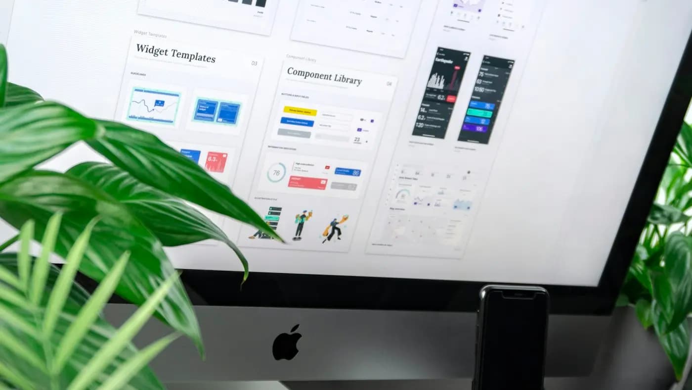
You do not need an art background to make an interface that looks tidy and feels easy to use. Most amateur-looking screens share the same handful of problems: inconsistent spacing, too many fonts, weak contrast and unclear buttons. Fix those and the result jumps in quality.
These UI design basics for non-designers come as eight rules. They suit anyone building a website, an app mock-up, a dashboard or a form with a simple tool.
Rule 1: Decide what the screen is for
Every screen should have one main purpose. Before you drag a single element, finish this sentence: "On this screen, the user should be able to ___."
Then list the elements that help and put the others aside. A booking screen might need a date picker, a time list and a confirm button. A news ticker and a social feed do not belong there.
Limiting purpose limits clutter. It also tells you which element deserves to be the most prominent one, which leads straight to the next rule.
Rule 2: Create hierarchy with size and weight
Users should know what to look at first. Hierarchy is how you tell them.
- Make the most important item the largest or boldest.
- Use a step down for secondary items.
- Make the least important items smallest and lightest.
Try limiting yourself to three text sizes at first: a heading, a body size and a small size for captions and labels. Resist adding more until you have a reason. Consistent steps look intentional, while random sizes look messy. The graphic design principles for marketers post explains contrast and emphasis in more depth.
Rule 3: Use a spacing system
Spacing is the single biggest difference between amateur and professional layouts. The trick is consistency.
Pick a base unit, such as eight pixels, and use only multiples of it for gaps and padding: eight, sixteen, twenty-four, thirty-two. This removes guesswork and gives your design rhythm.
- Put more space between groups than within groups. Related items should sit closer together.
- Keep equal padding inside cards and buttons.
- Give the page generous outer margins.
When something looks off but you cannot say why, check the spacing first. Nine times out of ten the gaps are uneven.
Rule 4: Align everything
Alignment creates calm. Elements that line up on a shared edge feel organised, even in a busy layout.
- Choose a left edge and align text and buttons to it.
- Avoid mixing centred and left-aligned text on the same screen without a reason.
- Use a simple column grid, such as twelve columns on desktop and a single column on mobile.
- Align icons with the first line of the text they accompany.
Most design tools offer guides and smart snapping. Turn them on and trust them.
Rule 5: Pick limited type and colour
Typography
- Use one or two font families. A single family with several weights is often enough.
- Choose a font designed for screens, with clear letterforms.
- Keep body text at a comfortable size and line height.
- Avoid long lines of text; keep them to a readable width.
For more on pairing, see typography for brands.
Colour
Choose one main colour for key actions, a set of neutrals for text and backgrounds, and a couple of semantic colours for success, warning and error states. That is nearly all you need. Reuse the same colours throughout and record them in a small list. If you have no palette yet, the brand colour palette guide walks you through building one.
Always check contrast between text and background. Light grey text on white may look elegant on your monitor and disappear on a phone in sunlight. The accessible web design basics article explains how to check.
Rule 6: Make interactive elements obvious
Users should never wonder what they can click.
- Buttons should look like buttons: filled shape, clear label, enough padding.
- Links should be visibly different from normal text, for example by colour and underline.
- Primary actions should look stronger than secondary ones. Use a filled button for the main action and an outline or text style for the alternative.
- Keep tap targets large enough for a thumb, with space between them.
Show states. A button should change slightly when hovered, pressed or disabled, and fields should show when they are focused or have an error. These small cues reassure users that the interface is responding.
Write labels that say what happens
A button reading "Continue to payment" is clearer than "Next". An error reading "Enter a valid phone number" is more helpful than "Invalid input". The UX writing and microcopy post is a good guide.
Rule 7: Stay consistent
Consistency lets users learn your interface once and apply it everywhere. Decide a pattern and reuse it.
- Same button style for the same kind of action.
- Same icon style, with matching line weight and corner radius.
- Same card layout for similar content.
- Same position for navigation and key actions on every screen.
Build a small kit of reusable parts, such as a button, an input field, a card and a heading style. Many tools let you save these as components so a change in one place updates everywhere. Creating this kit is a mini design system, and it saves hours.
It also helps to follow familiar conventions. Put the logo at the top left, make it link home, and place the main menu where people expect it. Surprises are rarely welcome in navigation.
Rule 8: Test with a real person
You know your design too well to judge it. Ask someone unfamiliar to try a task, such as finding a price or booking a time slot, while you stay quiet and watch.
- Give them a realistic goal, not instructions.
- Note where they hesitate or tap the wrong thing.
- Ask what they expected to happen.
- Fix the biggest problem first, then test again.
Even three or four quick sessions with friendly strangers reveal obvious issues. Also check your design on a real phone, not just a laptop window resized to look small.
Use references, not guesses
When you are stuck, borrow structure. Look at well-made sites and apps for how they lay out a pricing table, a sign-up form or a product page. Study the spacing, the hierarchy and the wording, then create your own version. Do not copy another brand's identity or assets; learn the pattern and apply it to your content.
If you are laying out a full page, the landing page design principles and mobile-friendly website design tips give you ready structures.
A hypothetical example
Imagine a freelance tutor building a simple booking page with a free template. The first version uses four fonts, three button colours, uneven gaps and tiny grey text. After applying these rules, it uses one font in three sizes, one accent colour for the booking button, an eight-pixel spacing scale, left-aligned content and darker text. Nothing about the content changed, yet the page looks credible and the button is impossible to miss.
A quick checklist before you finish
- One clear purpose per screen.
- Three text sizes or fewer, with obvious hierarchy.
- Spacing based on a consistent unit.
- Everything aligned to a grid or edge.
- Limited colours with strong contrast.
- Buttons that look clickable and say what they do.
- Consistent components across screens.
- Tested on a phone and with a real person.
Handling forms, empty states and errors
Beyond the main screens, three small moments shape how professional an interface feels.
Forms
Stack fields in a single column, group related fields and mark optional ones clearly. Use the right input type, such as a number pad for phone numbers on mobile. Keep the submit button directly under the last field.
Empty states
When a list or dashboard has nothing yet, do not show a blank rectangle. Add a short friendly line explaining what will appear here and a button to create the first item.
Error and success messages
Say what went wrong and how to fix it, place the message near the problem and use colour plus an icon or text, not colour alone. Confirm success briefly, so people know their action worked.
Designing these moments takes only a few minutes and removes a lot of confusion. Add them to your checklist whenever you build a new screen, and test them by deliberately making mistakes yourself.
Takeaway
Good UI is mostly discipline: fewer elements, consistent spacing, clear hierarchy, readable type and obvious actions. You can apply these eight rules in any tool, from a website builder to a design app.
If you would like a professional interface or website designed for your business, explore the websites portfolio or get in touch.
Frequently asked questions
What is the easiest way to improve a UI design?
Fix spacing and alignment first. Use a consistent spacing unit, align elements to a shared edge, and give related items more closeness than unrelated ones. These changes often transform a layout without changing content.
How many fonts should I use in a user interface?
One or two families are enough, and a single family with several weights often works best. Limit text to three or four sizes so the hierarchy looks deliberate rather than random.
How do I make buttons look clickable?
Give them a filled shape, a clear verb-based label, comfortable padding and strong contrast. Show hover, pressed and disabled states, and make the main action look stronger than secondary actions.
Do I need a design system as a non-designer?
A full system is not required, but a small kit of reusable parts helps. Save your button, input, card and heading styles as components so everything stays consistent and edits update everywhere.
Related articles
Website Design7 min read
404 Page Design: Turn Dead Ends Into Helpful Detours
Good 404 page design keeps lost visitors on your site. Learn what to write, what to include and how to find and fix the broken links that cause the problem.

Website Design7 min read
Cookie Consent Banner Guide: Clear, Fair and Easy to Use
A practical cookie consent banner guide: what to audit, how to word choices, where to place it and how to keep it fair, with a reminder to check local rules.

Website Design8 min read
Core Web Vitals Explained in Plain English for Site Owners
Core Web Vitals explained without jargon: what the three measures mean, how to check them for free, and the simple fixes that make your pages feel faster.