
Website Design
Website Navigation Best Practices for Menus That Guide
By Kavin P · · 7 min read
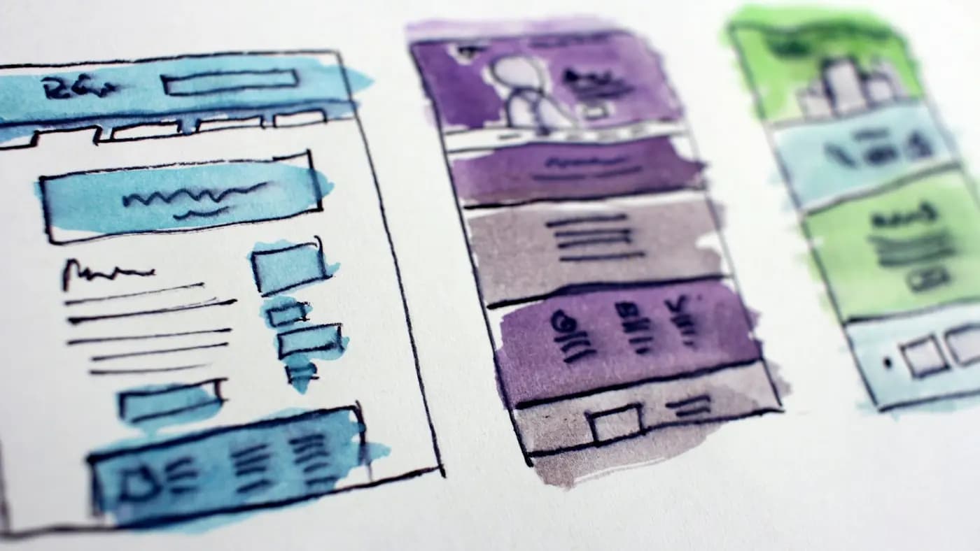
Navigation is the signposting of your website. When it works, nobody notices it. When it fails, visitors hunt, guess, and eventually leave. These website navigation best practices focus on decisions you can make with a pen, a pile of sticky notes and a free afternoon, long before any design software opens.
Think of navigation as answering questions
Every menu item is an answer to a question a visitor already has. Before you draw a menu, list those questions. For a hypothetical neighbourhood dental clinic, they might be: what treatments do you offer, where are you, how much does it cost, can I book online, and who will I see?
Now turn each question into a short label. The menu becomes a list of answers, not a list of internal departments. A common mistake is organising the menu around how the business is structured (divisions, teams, product lines) instead of how visitors think.
Keep the top level short
A short top-level menu is easier to scan and easier to tap on a phone. There is no magic number, but if you cannot read the whole menu in a single glance, it is probably too long.
To shorten a long menu:
- Group related pages under one parent item.
- Move rarely needed pages (privacy policy, terms, sitemap) to the footer.
- Remove pages nobody visits and nobody needs.
- Combine thin pages that cover the same ground.
Resist the urge to add a menu item to satisfy an internal stakeholder. Each addition makes every other item slightly harder to find.
Use plain, specific labels
Labels are where navigation most often goes wrong. Clever or vague words force visitors to guess what is behind them.
- Prefer "Services" over "What we do" or "Solutions".
- Prefer "Pricing" over "Investment".
- Prefer "Contact" over "Let's talk".
- Prefer "Blog" or "Guides" over "Insights" unless the content truly fits.
Keep labels to one or two words where possible, and keep them consistent. If a page is called "Services" in the menu, the page title and heading should not call it "Offerings".
Match labels to search language
Visitors often arrive from search with a specific term in mind. If they search for "wedding photography" and your menu says "Celebrations", the mismatch costs you. Using the words people already use helps both visitors and search engines understand the page. For more on how structure and wording work together, see website structure for SEO.
Design a clear hierarchy
Most small business websites need only two levels: top-level pages and a handful of child pages. Deeper nesting hides content.
A useful test is the three-click rule of thumb, which is less a law than a warning. If an important page is buried so deep that you cannot reach it quickly from the homepage, either surface it or link to it from related content.
Dropdowns and mega menus
Dropdowns suit sites with several distinct service or product groups. Keep them to one level, make the parent item clickable so it leads to an overview page, and avoid menus that vanish if the pointer drifts slightly. Large mega menus can work for big catalogues, but they need clear grouping and enough spacing to be usable.
Make the primary action obvious
Most sites have one action that matters above all others: contact, book, buy or request a quote. Give it a distinct place in the navigation, often a button-styled item at the far right of the header.
This button should look different from regular links but not shout. One highlighted item stands out. Three highlighted items cancel each other out.
Design for mobile first
Many visitors use a phone, and mobile navigation has its own demands.
- Use a clear menu icon with a visible label or familiar pattern, so nobody wonders what it does.
- Make tap targets large enough for a thumb, with space between them to avoid accidental taps.
- Keep the menu opening and closing predictable. It should close when a link is chosen.
- Place the most important action where it is easy to reach.
- Avoid hover-dependent behaviour, because phones have no hover.
The wider guidance in mobile-friendly website design tips covers more of the small-screen experience.
Add secondary navigation where it helps
The main menu is not the only way to move around. Supporting elements fill gaps:
- Breadcrumbs show where a page sits in the hierarchy and give a quick route back up. They are most useful on sites with many nested pages.
- Footer links carry the pages that matter but do not deserve top billing, such as policies, careers and sitemaps.
- In-content links guide readers from one topic to the next. A well-linked blog post is a navigation tool in its own right; the internal linking strategy guide explains how.
- Search helps on large sites. Place it where visitors expect it, usually the header, and make sure results are sensible.
- Related items at the end of pages suggest a next step instead of a dead end.
Show visitors where they are
Orientation reduces anxiety. Highlight the current page in the menu, keep page headings consistent with menu labels, and keep the header in the same place on every page. Visitors build a mental map of your site. Changing the layout between pages breaks it.
Links should look like links, and visited versus unvisited states can help on content-heavy sites. Avoid mystery elements that look clickable but are not.
Make navigation accessible
Good navigation works for everyone, including people who use a keyboard or screen reader.
- Make sure every menu item can be reached and activated with the keyboard alone.
- Keep a visible focus indicator on the item currently selected.
- Use real links and buttons rather than decorative elements that mimic them.
- Provide enough contrast between menu text and background.
- Offer a way to skip repeated header content and jump to the main content.
The checklist in accessible web design basics goes into these points in more detail.
Test your navigation with real people
You do not need a lab. A simple method works well:
- Ask three to five people who have never seen the site to find specific things, such as "Find out how to book" or "Find the price of the basic package".
- Stay quiet and watch where they click first.
- Note where they hesitate, backtrack or give up.
- Adjust labels or structure, then repeat with a few new people.
Another low-cost approach is card sorting. Write each page on a card, ask people to group the cards and name the groups. Their groupings and names tell you what labels and structure feel natural.
Analytics adds a second view. Look at which menu items are rarely clicked and which pages visitors reach only through search. Both can point to labels that are unclear or pages that are poorly placed.
Plan for both new and returning visitors
New visitors need orientation: what you do, who it is for, and where to start. Returning visitors want speed: login links, order tracking, contact details, or the latest content. A single menu can serve both if you separate the two jobs clearly.
- Keep the main menu for explaining what the site offers.
- Put account, login or booking links in a small utility area at the top right.
- Keep phone numbers and addresses in the header or footer so they are never more than a glance away.
- Review the pages visitors reach most often and make sure each is only one click from the header.
This small exercise often reveals that a page the business considers minor is the one customers use every week.
Common navigation mistakes to avoid
- Menus that change order or content from page to page.
- Too many levels of dropdowns.
- Labels invented by the marketing team that nobody else uses.
- A homepage link that is missing or hidden. The logo should return visitors home, and a clear "Home" link helps those who do not expect that.
- Pages that exist but are not linked from anywhere.
- Contact details that require three clicks to find.
If you are rebuilding a site, fold navigation planning into your wider website redesign checklist so labels, structure and redirects are handled together.
Takeaway
Good navigation starts from visitor questions, not company structure. Keep the top level short, use plain labels, limit hierarchy depth, give the key action a clear place, and design the mobile menu with the same care as the desktop one. Then test with a handful of real people and adjust.
If your site's menu feels cluttered and you would like help reorganising it, reach out through the contact page and describe what you have today.
Frequently asked questions
How many items should a main menu have?
There is no fixed number, but fewer is usually better. If visitors cannot take in the whole menu at a glance, group related pages together or move low-priority pages into the footer.
Should I use a hamburger menu on desktop?
Generally no. On wide screens, a visible menu is faster and clearer because visitors do not need to open anything. Keep the collapsed menu pattern for small screens where space is limited.
Do dropdown menus hurt SEO?
Not by themselves, as long as the links are real, crawlable links and the destination pages are useful. Problems arise when important pages are buried or only reachable through scripts that search engines cannot follow.
How often should I review my navigation?
Review it whenever you add a major service or section, and at least once a year. Check for unclear labels, unused items and pages that have become hard to reach.
Related articles
Website Design7 min read
404 Page Design: Turn Dead Ends Into Helpful Detours
Good 404 page design keeps lost visitors on your site. Learn what to write, what to include and how to find and fix the broken links that cause the problem.

Website Design7 min read
Cookie Consent Banner Guide: Clear, Fair and Easy to Use
A practical cookie consent banner guide: what to audit, how to word choices, where to place it and how to keep it fair, with a reminder to check local rules.
Website Design8 min read
Core Web Vitals Explained in Plain English for Site Owners
Core Web Vitals explained without jargon: what the three measures mean, how to check them for free, and the simple fixes that make your pages feel faster.