
Marketing Analytics
Looker Studio Dashboard: Build One People Actually Use
By Kavin P · · 7 min read
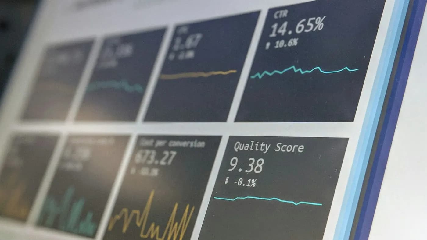
A dashboard is a promise: open this page and you will know how marketing is doing. Many dashboards break that promise by showing everything and explaining nothing. Building a Looker Studio dashboard that people open every week takes more thinking than clicking.
This guide covers who the dashboard is for, what to include, how to connect and prepare data, how to lay it out, and how to keep it healthy.
Decide who the dashboard is for
A dashboard built for everyone is useful to no one. Start by naming one primary reader and one decision they make with it.
- A business owner wants to know whether leads and sales are moving the right way, and where the money goes.
- A marketing manager wants to compare channels and spot problems early.
- A client wants proof of progress without jargon.
Write one sentence: "This dashboard helps [reader] decide [decision]." Everything that does not support that sentence belongs on a different page or in a different report. For general advice on choosing measures, the marketing dashboard guide and the marketing KPIs to track post are useful companions.
Pick a small set of metrics
Aim for a handful of headline numbers at the top, then supporting detail below. A sensible structure is:
- Outcomes. Leads, sales, revenue or bookings.
- Efficiency. Cost per lead, cost per sale, or return on spend.
- Drivers. Traffic by channel, top landing pages, campaign results.
- Quality signals. Conversion rate by source, repeat purchase or lead-to-customer rate.
Resist adding a metric just because it is available. Ask what action someone would take if the number went up or down. If the answer is "nothing", leave it out.
Prepare your data before you build
The most common reason for a confusing dashboard is messy source data, not poor design.
Connect the right sources
Looker Studio can read from analytics tools, ad platforms, spreadsheets, search data and databases. Connect only what the dashboard needs. Each extra source adds loading time and a new thing that can break.
Clean the inputs
- Use consistent campaign naming. If your links are tagged inconsistently, channels will split into duplicates. The UTM parameters guide explains a clean approach.
- Make sure conversions are defined. A dashboard can only display what was set up properly; see GA4 events and conversions.
- Use a spreadsheet for manual data. Offline sales, call outcomes or monthly budgets can live in a simple sheet that the dashboard reads. Keep the columns tidy: one row per period, one column per measure, no merged cells.
Blend data carefully
Combining sources, for example ad cost with lead counts, is powerful but fragile. Only join on a field that genuinely matches, such as date or campaign name, and check totals against the original platforms. If numbers disagree, find out why before sharing the dashboard.
Design the layout
Good layout guides the eye. Think of the page like a newspaper front page: the headline first, details after.
Top: the scorecard row
Place four to six scorecards across the top showing the outcome and efficiency measures. Add a comparison to the previous period so a reader sees direction at a glance. Use plain labels such as "Enquiries" instead of internal jargon.
Middle: trends and breakdowns
A line chart showing change over time tells the story of momentum. Beside it, a bar chart comparing channels or campaigns shows where results come from. Keep each chart to one clear message and give it a descriptive title like "Enquiries by channel" rather than "Chart 3".
Bottom: detail tables
Tables are for people who want to dig in. Limit the number of columns and sort by the most important measure. Add conditional formatting sparingly, only to flag what needs attention.
Visual rules that help
- Use a consistent colour for each channel across every chart.
- Leave generous white space.
- Avoid pie charts with many slices and 3D effects.
- Keep fonts readable and sizes consistent.
More on this subject appears in data visualization for reports.
Add controls that help, not hinder
Filters let readers explore, but too many make the page feel like a cockpit.
- A date range control is almost always needed. Set a sensible default, such as the last full month.
- One or two filters, for example channel or country, are usually enough.
- Pages or tabs can separate topics: overview, paid ads, search, email. Keep the overview page strong enough to stand alone.
Test the default view as if you were opening it for the first time. It should make sense with no clicking.
Keep it fast and reliable
A slow dashboard stops getting opened.
- Limit the number of charts per page.
- Avoid huge tables that pull many rows.
- Use data extracts for sources that rarely change, so the report does not query them live every time.
- Remove unused fields and data sources.
- Check that scheduled data refreshes are working, and note the "last updated" time on the page.
Access matters as well. Share with named people rather than leaving links open to anyone, especially when the data includes revenue or customer information.
Add context so numbers make sense
A number without context invites wrong conclusions. Add short text boxes that explain:
- What the dashboard covers and the date range
- How a key measure is defined, such as what counts as a lead
- Known data issues, for example "tracking was fixed mid-month"
- Notes on campaigns or events that explain spikes
This small habit prevents many arguments in meetings. To turn the numbers into a narrative, read about marketing report storytelling.
Maintain the dashboard
Treat the dashboard like a product, not a one-off project.
- Review monthly. Which charts did anyone actually discuss? Remove the rest.
- Check against source platforms. Spot-check totals so drift is caught early.
- Update when the business changes. A new service, a new channel or a changed goal should change the dashboard.
- Collect feedback. Ask readers what they looked for and could not find.
- Keep a change log. A short note listing what changed and when saves confusion later.
Common mistakes
- Starting with the tool instead of the questions
- Showing every available metric
- Mixing different date ranges on one page without saying so
- Forgetting to explain definitions
- Never checking whether the data is still flowing
A hypothetical example layout
Imagine a small online furniture shop that wants a weekly view for its owner. The top row shows orders, revenue, ad spend and return on spend, each compared with the previous week. Below that, a line chart tracks orders over the last three months, next to a bar chart comparing search, social, email and direct visits by orders rather than by visits. A small table lists the five product pages with the most views but the fewest purchases, which is a ready-made to-do list for the week.
Notice what is missing: bounce-style measures, long lists of countries and a dozen social metrics. The owner can read this page in under two minutes and knows where to look next.
Plan the handover
A dashboard that only its creator understands will be abandoned the moment that person is busy. Before sharing it:
- Walk one real reader through the page and note where they hesitate.
- Write a short guide covering what each section means, where the data comes from and who to ask about changes.
- Agree how often it is checked, and who acts on what it shows.
- Decide what happens when a number looks wrong, so the first response is a calm check of the source and not a panic.
Without these habits, even a well-designed report turns into a decoration. With them, it becomes part of how the team runs the week.
Takeaway
A useful Looker Studio dashboard starts with one reader and one decision, uses a small set of well-defined metrics, relies on clean and consistent data, and follows a layout that moves from outcomes to detail. Keep it quick, add context, and review it regularly.
If you would like help planning a reporting view for your business, reach out here or look through the downloadable resources for planning templates.
Frequently asked questions
Is a Looker Studio dashboard suitable for a small business?
Yes. It works well for small teams because it can read from spreadsheets, analytics tools and ad platforms without a large budget. Start with one overview page covering leads, cost and traffic sources, then expand only when a real question needs more detail.
How many charts should one dashboard page have?
Fewer than most people expect. A row of headline scorecards, one trend chart, one channel comparison and one detail table is often enough. Each extra chart slows loading and dilutes attention, so include only what supports a decision.
Why do my dashboard numbers differ from the ad platform?
Differences usually come from attribution settings, date or time zone handling, conversion definitions, or data delays. Compare like with like, document the definitions on the dashboard, and accept small gaps, but investigate any large mismatch before sharing results.
How often should a dashboard be reviewed?
Check the data daily or weekly if you act on it, and review the design monthly. Remove charts nobody discusses, confirm data refreshes are running, and update metrics whenever your goals, services or channels change.
Related articles

Marketing Analytics8 min read
A/B Testing for Marketers: Run Tests You Can Trust
A/B testing for marketers made practical: form a hypothesis, pick one change, run a fair test, and learn something useful even when the result is a tie.

Marketing Analytics7 min read
Cohort Analysis for Marketers: See Who Sticks Around
Cohort analysis groups customers by when or how they arrived, so you can see retention and repeat behaviour clearly. Learn to build and read your first cohort.

Marketing Analytics7 min read
Customer Lifetime Value: How to Work It Out and Use It
Calculate customer lifetime value with simple maths, learn what to feed into it, and use it to set smarter ad budgets, offers and retention priorities.