
Marketing Analytics
Marketing Dashboard Guide: Build One People Actually Use
By Kavin P · · 7 min read
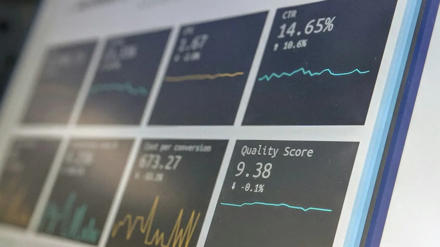
Most marketing dashboards fail for the same reason: they were built to show everything, so nobody looks at them. A good dashboard answers a handful of questions quickly and points to the next action. This guide walks you through planning, building and maintaining one that people genuinely open.
Start With Questions, Not Charts
Before you open any tool, write down the decisions the dashboard should support. A chart that does not change a decision is decoration.
Typical questions worth answering:
- Is the business getting more of the right people to the site or shop?
- Which channels bring people who actually enquire or buy?
- Is anything broken or drifting that needs attention this week?
- Where should the next hour or the next rupee go?
If you cannot attach a question to a chart, remove the chart. Your dashboard should feel closer to a car instrument panel than a warehouse of data.
Know Who the Dashboard Is For
A business owner, a marketing manager and a specialist running ads need different views. Trying to serve all three on one page produces clutter.
The owner view
Owners usually want a few outcome numbers: enquiries, sales, revenue and cost of getting them. Keep this to one screen with plain labels and no jargon.
The manager view
Managers need to compare channels and spot trends. Add breakdowns by source, campaign and landing page, plus a note on what changed since last period.
The specialist view
Specialists need diagnostic detail such as search terms, ad sets or page-level behaviour. This view can be dense because the reader is willing to dig. Keep it separate from the other two.
Choose a Small Set of Metrics
Pick metrics in three layers so the story reads from top to bottom.
- Outcomes: leads, orders, bookings, revenue. These are what the business cares about.
- Efficiency: cost per lead, cost per order, return on spend. These tell you whether you are getting value.
- Drivers: traffic by source, click-through rate, conversion rate, email sign-ups. These explain why the top numbers moved.
If you need help deciding what to include, the marketing KPIs to track guide covers how to match metrics to goals, and the marketing funnel metrics guide shows how to organise them by stage.
A sensible target for a small business is somewhere between six and twelve numbers on the main page. More than that and the eye has nowhere to land.
Get the Data In Reliably
A dashboard is only as good as the data feeding it. Before designing anything, check the plumbing.
- Tracking: confirm that conversions such as form submissions, calls and purchases are recorded correctly. The Google Analytics 4 basics post explains how events and conversions fit together.
- Naming: use consistent campaign tags so sources do not fragment into five spellings of the same thing. The UTM parameters guide is a good reference.
- Definitions: agree what counts as a lead. A newsletter sign-up and a quote request are not the same thing, and mixing them hides the truth.
- Connections: decide whether data flows in automatically from your tools or is pasted from exports. Automatic is better, but a tidy weekly paste is better than a broken connector nobody trusts.
Write the definitions in a short note attached to the dashboard. Six months later, you will be glad it exists.
Design for Quick Reading
Layout matters more than most people expect. Treat the page like a one-page report.
Put the most important numbers at the top
Place outcome numbers in large type across the top row. Add a small comparison with the previous period so the reader sees direction at once.
Use the right chart for the job
- Line charts for change over time.
- Bar charts for comparing channels or campaigns.
- Tables for detail where exact numbers matter.
- Single number cards for headline results.
Avoid pie charts with many slices, three-dimensional effects and decorative gauges. They are harder to read and add nothing.
Keep colour meaningful
Use one colour per channel across the entire dashboard so readers learn the mapping. Reserve red and green for good and bad, and make sure the page still works for people who cannot tell them apart by adding labels or arrows.
Add short annotations
A line such as "Festival offer began here" or "Site was down for one day" prevents misreading. Annotations turn a chart into a story.
Pick Tools That Match Your Size
You do not need an expensive platform. Many small teams do well with a free dashboarding tool connected to their analytics and ad accounts, or even a well-structured spreadsheet.
Consider these questions when choosing:
- Can it connect to the sources you already use?
- Can a non-technical colleague edit it?
- Can it be shared as a link or sent as a scheduled email?
- Will it still be maintainable when the person who built it is busy?
Start in the simplest tool that meets those needs. You can migrate later once you know what you actually look at every week.
Build a Review Rhythm
A dashboard without a routine becomes wallpaper. Decide when it will be reviewed and what happens afterwards.
A simple weekly rhythm:
- Open the dashboard and check the outcome numbers.
- Note anything that moved noticeably up or down.
- Look at the driver metrics to find a likely cause.
- Write one or two actions with an owner and a date.
- Record what you changed so you can judge the effect later.
Imagine a small bakery that sells celebration cakes through its website and WhatsApp. Its dashboard might show orders, enquiries, cost per enquiry and traffic by source. If enquiries drop in a week, the owner checks whether traffic fell, whether the order form still works and whether a social post that usually drives enquiries was skipped. The dashboard narrows the search in minutes rather than hours. This is a hypothetical example, but the pattern applies to almost any small business.
Plan the Meeting Around the Page
The dashboard is a conversation starter, not the conversation itself. A fifteen-minute review works well when it follows a fixed order: what happened, why it probably happened, what to do and who will do it. Ask one person to bring a single observation they noticed outside the numbers, such as a customer comment or a competitor offer, because context often explains movements that charts cannot.
When a number looks surprising, resist reacting straight away. First check that tracking still works, that the date ranges match and that no campaign was paused. Many scares turn out to be measurement slips rather than real change.
Keep Reporting Honest
A few habits keep a dashboard trustworthy.
- Show uncertainty: small numbers fluctuate. If a campaign has only a handful of conversions, say so rather than celebrating or panicking.
- Separate correlation from cause: a rise after a campaign is a clue, not proof. The incrementality and testing trend article explains why structured tests help.
- Do not hide bad news: a dashboard that only flatters will not be trusted. Include the metrics that are uncomfortable.
- Compare like with like: seasonal businesses should compare against the same season, not just the previous month.
If you report to clients, the principles in SEO reporting for clients apply to any channel: lead with outcomes, explain changes plainly and finish with next steps.
Maintain It Like a Product
Dashboards decay. Campaigns end, tools change names and goals shift. Schedule a short review every quarter.
- Remove charts nobody has looked at.
- Check that every connection is still pulling data.
- Update targets and definitions.
- Ask the readers what they wish the dashboard showed and what they ignore.
Keep a simple change log so anyone can see what was altered and why. This also makes handovers easier when team members change.
Takeaway: Fewer Numbers, Clearer Decisions
A useful marketing dashboard starts with questions, serves a specific reader, uses a small set of trustworthy metrics and is reviewed on a regular rhythm. Build the first version small, ship it, and improve it based on how people actually use it.
If you would like templates and checklists to speed this up, browse the resources page. If you want a hand setting up reporting for your business, you can get in touch and talk through what you need.
Frequently asked questions
What should a marketing dashboard include?
Include a few outcome numbers such as leads or sales, efficiency measures like cost per lead, and driver metrics such as traffic by source and conversion rate. Keep the main page to roughly six to twelve numbers, each tied to a decision.
How often should I review my marketing dashboard?
Review it weekly for operational decisions and monthly for trends and planning. Add a quarterly clean-up to remove unused charts, check data connections and update goals so the dashboard stays relevant to how you work.
Do I need paid software to build a dashboard?
No. A free dashboarding tool connected to your analytics and ad accounts, or a tidy spreadsheet, is enough for most small businesses. Choose the simplest option your team can maintain and upgrade only when you outgrow it.
Why does nobody use the marketing dashboard?
Usually it shows too many metrics, serves no specific reader or answers no clear question. Rebuild it around the decisions your team makes, trim it to key numbers and set a regular review meeting so it becomes a habit.
Related articles

Marketing Analytics8 min read
A/B Testing for Marketers: Run Tests You Can Trust
A/B testing for marketers made practical: form a hypothesis, pick one change, run a fair test, and learn something useful even when the result is a tie.

Marketing Analytics7 min read
Cohort Analysis for Marketers: See Who Sticks Around
Cohort analysis groups customers by when or how they arrived, so you can see retention and repeat behaviour clearly. Learn to build and read your first cohort.

Marketing Analytics7 min read
Customer Lifetime Value: How to Work It Out and Use It
Calculate customer lifetime value with simple maths, learn what to feed into it, and use it to set smarter ad budgets, offers and retention priorities.