
Creative Design
Infographic Design Tips: Turn Complex Ideas Into Clear Visuals
By Kavin P · · 8 min read

An infographic works when it makes something complicated easy to grasp at a glance. It fails when it becomes a crowded poster of facts. These infographic design tips help you plan, structure and polish visuals that people actually finish reading and want to share.
Decide whether an infographic is the right format
Not every topic deserves an infographic. The format suits information that has a shape: a process with steps, a comparison between options, a timeline, a checklist, or a set of numbers that relate to each other.
It is a poor fit for opinions, long arguments or topics that need nuance. Those are better as articles or short videos.
Before starting, ask three questions:
- Can the main idea be stated in one sentence?
- Is there a natural order or structure, such as steps or categories?
- Will a visual explain it faster than a paragraph would?
If the answer to all three is yes, you have a good candidate. If not, consider a simpler format such as a carousel, which is covered in carousel post ideas.
Start with the story, not the decoration
The best infographics have a single message and a beginning, middle and end. Write the story as plain text first.
A useful outline looks like this:
- Hook: a title that promises a clear benefit or answers a question.
- Context: one or two lines explaining why the topic matters.
- Body: three to seven points, steps or comparisons.
- Conclusion: a short takeaway or next step.
- Source and branding: your logo and, where relevant, where information came from.
Cut anything that does not support the main message. A common mistake is to include every fact you have gathered. Viewers remember a few clear points far better than many crowded ones.
Imagine a small accounting practice making an infographic on preparing documents for tax season. It lists five steps: gather income records, collect expense receipts, check identification details, organise by category, and book a meeting. That is the whole graphic. Extra tax rules go in a separate article.
Choose a layout that matches the content
The layout should mirror the way information is naturally organised.
- Vertical flow: ideal for step-by-step processes and long-form explainers that people scroll through.
- Timeline: best for history, roadmaps or sequences over time.
- Comparison columns: useful for pros and cons, before and after, or option A versus option B.
- Grid or card layout: good for tips, tools or categories of equal importance.
- Flowchart: suited to decisions where each answer leads to a different path.
Use a clear grid and consistent spacing so the eye can follow the path. Number steps or use arrows to show direction. If a viewer has to wonder where to look next, the layout needs adjustment.
Make data visuals honest and readable
If your infographic includes numbers, the chart type matters.
Pick the simplest chart that works
- Use bars to compare quantities.
- Use lines to show change over time.
- Use a simple part-to-whole shape only when there are few categories.
- Use icons or large numbers when one figure is the star.
Keep charts truthful
Start bar charts at zero, label axes clearly, and avoid decorative three-dimensional effects that distort proportions. Use only data you can source, and name the source on the graphic. Never invent numbers to make a point look stronger. If you do not have reliable data, build the infographic around steps, tips or definitions instead.
Use colour, type and icons with restraint
Choose a limited palette of three or four colours, with one used for emphasis. Too many colours make it impossible to tell what matters. The brand colour palette guide can help you pick colours that match your identity.
For type, stick to two fonts and clear size steps: a large title, medium section headings and readable body text. See typography for brands for pairing advice.
Icons should be from one consistent style, either outlined or filled, with the same stroke weight. Mixing styles makes a graphic look patched together. Use icons to reinforce meaning, not just to fill gaps.
Keep text short. Aim for brief phrases rather than full paragraphs, and break longer ideas into several small blocks.
Design for the places it will be seen
Think about where your infographic will live before choosing dimensions.
- Blog or website: tall formats work well, but make sure the text is legible when scaled down on a phone.
- Social media: consider splitting a long infographic into several square or portrait slides, so each section is readable without zooming.
- Email: keep file size modest and include a text summary, since some images may not load.
- Print or presentation: create a high-resolution version, and check margins for trimming.
Add descriptive alternative text and a short written summary on the page. This helps people who use screen readers, and it also helps search engines understand the content. The guidance in accessible web design basics explains why this matters.
Check, test and share
Before publishing, run through a review:
- Is the main message clear within five seconds?
- Is every fact correct and sourced?
- Can all text be read on a phone screen?
- Does the colour contrast hold up?
- Is there a logo or website address so people can find you after sharing?
- Does it lead somewhere, such as a link to a guide or contact page?
Ask someone unfamiliar with the topic to explain it back to you. If they struggle, simplify.
For distribution, pair the graphic with a short article, a social post and an email mention. Reusing one asset across channels is efficient, and the ideas in content repurposing ideas show how to stretch it further. If you plan content in advance, add it to your content calendar so it is not an afterthought.
Common infographic mistakes to avoid
Many infographics lose their audience for the same few reasons. Check your draft against this list.
- Too much text. If it reads like a document squeezed into a poster, split it into several graphics or move detail into an article.
- No clear starting point. Viewers should know instantly where to begin. A large title and a numbered first step solve this.
- Decoration over meaning. Clip art and heavy borders add noise. Every visual element should help explain something.
- Unreadable text size. Text that is fine on a desktop canvas can become tiny on a phone. Zoom out to a small screen while you work.
- Missing context. A graphic shared without your name or website cannot bring anyone back to you. Add a discreet logo and web address.
- Overlong format. An extremely tall graphic is awkward to share and often unreadable on social platforms. Consider a series instead.
A step-by-step build process
Use this process whenever you make one, from first idea to final file.
- Gather and verify content. Collect only facts and steps you can stand behind.
- Write the outline. Title, intro line, main points, closing action.
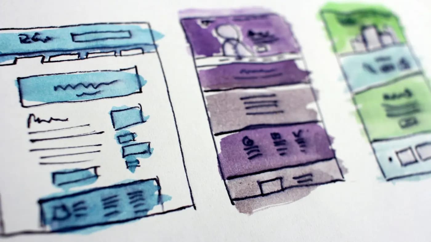
- Sketch low-fidelity boxes. Rough rectangles for each section reveal whether the order flows before you invest in visuals.
- Build the skeleton. Set up the canvas, grid, headings and placeholder blocks with your brand fonts and colours.
- Add icons and data visuals. Keep styles consistent, and align everything to the grid.
- Edit the words. Trim each phrase until nothing can be removed without losing meaning.
- Review at small size. Shrink the design to phone width. If the structure still makes sense, you have succeeded.
- Export in the right formats. Use a compressed image for web, a high-resolution file for print and a PDF if people may download it.
Ideas for topics you can cover
If you are unsure what to make, these topic types suit the format well without needing any statistics:
- A step-by-step process your customers often ask about.
- A checklist for preparing before a service, purchase or appointment.
- A comparison of two common approaches, with pros and cons.
- A glossary of terms beginners find confusing.
- A timeline showing how a project or process unfolds.
- A map of mistakes and fixes in your field.
Turn your most frequently asked customer questions into graphics, and you will create useful assets that also reduce repeated explanations.
Key takeaways
A strong infographic has one message, a structure that matches the content, honest data, restrained design and a clear next step. Plan the story first, choose the layout second and decorate last.
Pick one topic from your own expertise, outline it in five points, and sketch the layout on paper before opening any design tool. If you would like help creating polished visuals for your brand, you are welcome to get in touch or look through the design portfolio.
Frequently asked questions
How long should an infographic be?
As long as the story needs and no longer. Most work best with three to seven key points. If it feels overwhelming, split it into a series or move detail into an accompanying article.
What tools can I use to make an infographic?
Both beginner-friendly online design tools and professional software can work. Choose based on your skill and how custom the layout needs to be. The planning, structure and clarity matter more than the tool.
How do I make an infographic without statistics?
Build it around processes, checklists, definitions, comparisons or timelines. These formats are useful without numbers. If you do use figures, only include ones you can verify and cite clearly.
Where should I share my infographic?
Publish it on a relevant page of your website, then share sections on social platforms and in email. Include a short text summary and alternative text so it is accessible and easier for search engines to understand.
Related articles
Creative Design8 min read
Banner Ad Design Tips That Earn Attention and Clicks
Practical banner ad design tips for small businesses: structure, copy, imagery, sizes and testing, so your display ads get noticed without looking cluttered.

Creative Design8 min read
Business Card Design Tips for a Card People Actually Keep
Business card design tips for small business owners: what to include, how to lay it out, paper and finish choices, and how to prepare files for print.

Creative Design7 min read
Giving Design Feedback That Designers Can Act On
Giving design feedback is a skill. Learn how to describe problems, tie comments to goals, avoid vague notes and run a review round that ends with a better result.